Buttons
Los botones en Agave están pensados en el tipo de uso que se necesita tanto en aplicaciones web como en aplicaciones moviles.
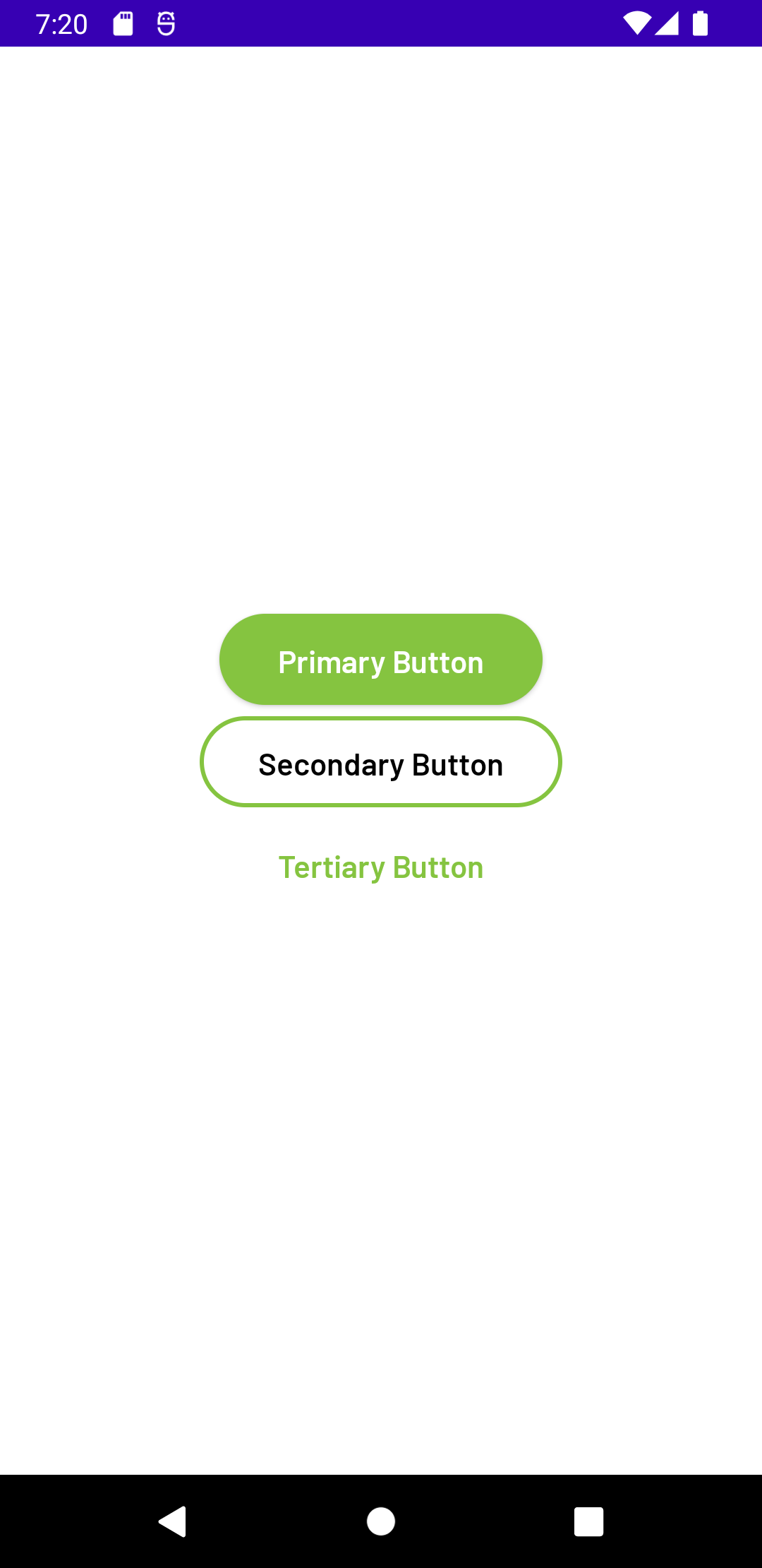
Tenemos 3 variantes en nuestros botones:
-
Primary:
Su uso representa acciones principales que queremos realizar.
-
Secondary:
Su uso representa acciones secundarias, como eventos de Cancelar o Atrás, por esto solo se deben usar junto con un botón de tipo primary.
-
Tertirary:
Se utiliza para aquellas acciones menos relevantes, y se usa junto a un botón de tipo primary.
El uso y proposito de cada botón lo encuentra definido en el Design System de Agave
- XML
- Jetpack Compose
Los 3 tipos de nuestros botones para XML están definidos así:
primary secondary tertiary
Entre las propiedades generales para estos 3 botones, tenemos lo siguiente:
-
app:text.- Texto a mostrar en el button.
-
app:type.-: Tipo de botón definido anteriormente en las variantes.
-
app:enable (opcional).-: Estado del button, habilitado (true) o inhabilitado (false).
-
Primary
<com.minutos.agave_xml.components.MaterialButton99
    android:layout_width="wrap_content"
    android:layout_height="wrap_content"
    app:text="Primary Button"
    app:type="primary"
app:enabled=true <!-- opcional -->/> -
Secondary
<com.minutos.agave_xml.components.MaterialButton99
    android:layout_width="wrap_content"
    android:layout_height="wrap_content"
    app:text="Secondary Button"
    app:type="secondary"
app:enabled=true <!-- opcional --> /> -
Tertiary
<com.minutos.agave_xml.components.MaterialButton99
    android:layout_width="wrap_content"
    android:layout_height="wrap_content"
    app:text="Tertiary Button"
    app:type="tertiary"
    app:enabled=true <!-- opcional --> />
Si tu intención es modificar las propiedades mediante código kotlin, también tenemos listos los métodos correspondientes.
val button99 = findViewById<MaterialButton99>(R.id.button99)

button99.setText("Button 1")

button99.isEnabled(true) //true or false

button99.setOnClickListener {
    //here your code
}
Al igual que los botones en XML, tenemos 3 variantes:
- TypeMaterialButton99.Primary
- TypeMaterialButton99.Secondary
- TypeMaterialButton99.Tertiary
Entre las propiedades generales para estos 3 botones, tenemos lo siguiente:
- text: Texto a mostrar en el button.
- type: Tipo de botón definido anteriormente en las variantes.
- enable (opcional): Estado del button, habilitado o inhabilitado.
- onClick: Evento click cuando se presiona el button.
MaterialButton99(type = TypeMaterialButton99.Primary, text = "Primary Button") {
    //action when clicked in button
}
MaterialButton99(type = TypeMaterialButton99.Secondary, text = "Secondary Button") {
    //action when clicked in button
}
MaterialButton99(type = TypeMaterialButton99.Tertiary, text = "Tertiary Button") {
    //action when clicked in button
}